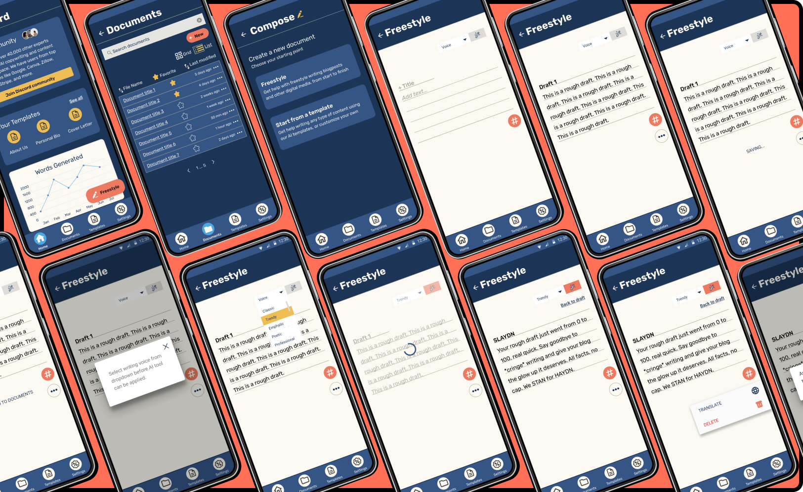
A Mobile Application for Android
Role: UX/UI Designer
Duration: 6 weeks
About HAYDN
HAYDN is an AI-driven content generator that helps anyone who has to write content, to do so quickly, easily and effectively. HAYDN has been trained on over 1 million pieces of content and can help you write content in minutes that is both high quality and engaging.
Project Brief
I was tasked with converting blank medium fidelity wireframes into high-fidelity wireframes with a client-provided style guide applied which included color, type, copy, and iconography applied. The app design was to have Material Design patterns implemented for use on Android phones.
The Result?
A high fidelity clickable prototype for the HAYDN app designed for Android, that expressively adheres to the client’s style guide. A user flow was developed for the AI content generation and tested with two users. Iterations were made based on usability test results.
Extended FABs for primary constructive actions
Navigation Bar: filled/selected & unfilled/unselected icons accompanied by text descriptors for accessibility
Dialog Box: basic dialog box to confirm high risk user decisions
Microinteractions: to communicate system status and prevent user error
The Assets
Working with a client-provided style guide streamlined much of the research and discovery phase of the design process.
Wireframes
Mid-fidelity wireframes were also provided for the general layout. I worked this guidance into my information architecture, drawing from the frame titles to create my navigation labels in the bottom navigation bar.
High-Fidelity Prototypes
Applying the Style Guide to the mid-fidelity wireframes
First iteration
I wired the high fidelity frames into clickable prototypes to be used in my usability testing.
Usability Testing
Moderated concurrent test with probing
Target Users
HAYDN’s primary target audience is marketers of all kinds who produce creative and technical writing as a profession or hobby (ie: email social media marketers, bloggers, content writers, social media managers, and more.
Task Scenario
Imagine you have a vlog that you like to keep current and post on frequently. In attempt to ease the load of constantly creating quality written content, you’ve signed up to try an AI-assisted writing tool called HAYDN. You know that this tool uses artificial intelligence, and other helpful features, to help writers of all sorts create unique and polished content/copy. You need to familiarize yourself with the platform a little first- start with the freestyle writing tool.
Task: Use the freestyle writing tool to compose a paragraph with a trendy AI writing style applied.
Quantitative Metrics
Successful task completion results when the user has made it to the final screen of the task flow, where “trendy AI has been applied to the rough draft
An “appropriate” window of time for task completion is < 5 minutes.
Qualitative Feedback
I followed up each test with follow-up questions to get a better idea of each user’s experience:
What did you find confusing about the interface and task flow?
What did you find straight forward about the interface and task flow?
How did the use of color and typography help or hinder you from completing the task?
Did you rely more on the copy to direct your flow, or the use of icons, symbols, and interactions?
Usability Test Results
100% task completion
50% appropriate time on task
Feedback: user flow not fluid
Feedback: confusion with microcopy (CTAs)
Iterative Designs
Changes to copy on Extended FAB: “compose” was changed to “freestyle”
V. 1
V. 2
Extended FAB button was rewired to drafting screen, instead of compose screen
V. 1
V. 2
“+New” extended FAB on Documents screen was repositioned and wired to Compose screen, to allow for an alternate path for users to reach the freestyle screen
Voice dropdown menu was brought closer to AI wand button to cue user input
V. 1
V. 2
V. 1
V. 2
A microinteraction to alert the user when a draft is auto-saved was implemented to replace the manual saving feature
V. 1
V. 2
The bottom menu was simplified to reduce cognitive load on user
V. 1
V. 2
Final Product
Next Steps
With more time and more a team of diverse contributors, the HAYDN app has much potential to launch. Some next steps might include:
Additional competitive research on implentation of features
A/B testing automation of AI feature vs. commitment-requirement from users (same with spelling/grammar correction)
A/B test different task flows from Dashboard (ie: see if usability results are improved with Dashboard FAB leading to Freestyle screen vs Compose screen)
Card sort and lo-fi testing for navigation labels and information architecture
Prototype & test other features of HAYDN
Responsive design for other devices
Impact & Reflections
Because I finished this project earlier in my program, I look at the designs and see where there can be small improvements and minor tweaks to produce a more elegant final product. Since I kept my focus on the functionality of the writing tool, I would polish the homepage and other main navigation pages and run some usability tests on those to ascertain their structure.
Though it skewed my usability test results, I did learn a lot from my user participant who is also a fellow designer. He questioned a lot of my design decisions in a way that made me realize perceptions I had not considered. For example, I altered a lot of padding and margins, white space, chunking and grouping, and UI element placements from my first iteration to second iteration.
This project taught me that sometimes the provided materials are not always ones that feel personally compelling to you, or representative of your style. It’s important to explore within boundaries, but also challenge (and test) components of a provided layout or style guide that don’t seem clear or necessary to you. However, it’s important to be able to differentiate impartialness due to personal opinion vs functionality. No need to reinvent the wheel unless it’s evidently warranted.


